Well after my orange fest of the past few days I am on a real colour kick. I love orange and and its not a colour you see used that much in interiors at the moment. So I have been looking for some other great interiors that use orange. Here's a selection;

I really like the mix of earthy tone sin this interior and the fantastic retro light. The tree mural adds a completely unique twist to what would otherwise be a quite predictable scheme.

Here a dash of burnt orange on the chair saves a scheme with much needed shot of colour.

Orange mixes surprisingly well with most colours and here we can see how it works in grown up way while always ensuring the interior has an element of excitiment.

Love, love this! Orange and grey is such a great combination. The floor lamp is a favourite of mine.
Orange is a great choice for a guest bedroom! A guest bedroom is a great place to experiment with any vibrant colour because it will only be used for a short amount of time, whereas in a master bed it might get a bit intense night after night. Be bold, brighten up your spare room and give your guests a real treat when they come to stay.
David Hicks is one of my absolute favourite interior designers and a great inspiration to me. I have such an attachement to retro interiors. They hold so much more interest for me than the great majority of contemporary design. I think its the boldness and unknowing freshness of the ideas that inspired me. These days it seems everthing has already done, and I'm bored of people being ever so clever reinventing everything. I'm afraid I'm a bit cynical about the whole thing. Anyhow here are a couple of Davids rooms with a nice use of orange. Can you imagine walking into these rooms, what an experience!

I love this use of all envoloping colour and pattern. There is such a joy in the way its has been so embraced on every surface. Hicks use of colour reminds me of Rothko paintings, and the way that he layered colours in an apparently carefree way to create a finely balanced composition that triggers a very particular response on the viewer.


Interiors are just the same; You carefully consider every detail and object to create an overall 'look' which is meant to have a very specific response from people entering that space. This may be awe, comfort, spectacle, welcome, homeliness, style, ease, this list is literally endless and the effects that each object adeed or removed from the scheme can be as subtle and profound as the difference of one shade in a Rothko painting.
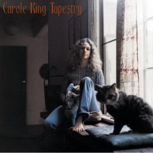
Today I'm listenng to the great Carole King - Tapestry. What a great album.


No comments:
Post a Comment